What is the best CRI for retail display lighting? The answer depends on the products, materials, and shopping atmosphere. A CRI of 90 or higher is often a strong starting point for fashion, cosmetics, jewelry, and premium merchandise. It can reveal skin tones, fabric colors, and subtle product finishes more naturally. However, CRI alone does not tell the whole story.
Lighting designer Randall Whitehead has said, “Good lighting makes people look good and feel comfortable.” That principle matters on a sales floor. A red jacket should appear rich, not dull. A diamond should show clean sparkle without harsh glare. A fresh food display should look appetizing under balanced light. These details influence trust, browsing time, and perceived product quality.
Still, a high CRI number can mislead. Some LEDs score well overall but reproduce saturated reds poorly. Retail teams should examine the R9 value, TM-30 results, color temperature, beam angle, and glare control. For many stores, CRI 90–95 offers a useful balance between visual quality, efficiency, and cost. Museums or luxury boutiques may demand even stricter color evaluation.
There is no perfect number.
The best choice should be tested in the actual store. Compare fabrics, packaging, metals, and skin tones under proposed fixtures. View them from normal customer distances. Record how colors change throughout the display. A small sample can expose a major weakness. My cautious conclusion is simple: choose CRI 90 or above, then verify the light with real merchandise rather than trusting the specification sheet alone.
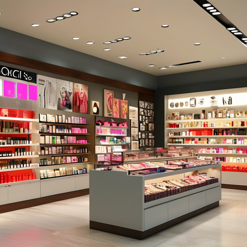
CRI, or Color Rendering Index, describes how accurately a light source reveals colors. The reference scale runs from 0 to 100. Ra is the average CRI value calculated from eight standard color samples. A higher Ra usually means more natural-looking merchandise. That distinction matters. CRI does not measure brightness, color temperature, or visual comfort. It also does not fully describe saturated colors.
For most retail displays, a CRI of 90 or higher is a practical target. Clothing, cosmetics, food, and artwork can look noticeably different under lower-quality light. Red products deserve extra attention. The standard Ra calculation excludes strong red samples, so an additional R9 value can reveal weaknesses. A display may score well overall but make red fabric appear dull or brown. That can affect how customers judge texture and freshness.
In real store evaluations, compare the same product under the proposed fixture and neutral daylight. Check skin tones, deep red packaging, blue fabrics, and metallic surfaces. A spectrometer can provide useful data, but direct visual testing remains important. A high number can still disappoint. Different fixtures with identical CRI ratings may produce different results because their spectral distributions vary. CRI is helpful, but it is not a complete purchasing decision. Color consistency, glare, flicker, energy use, and the store’s atmosphere also need careful review. The “best” CRI is therefore tied to the merchandise, not just the specification sheet.
For most retail environments, set the baseline at Ra ≥80. This level usually renders products clearly and supports comfortable everyday shopping. Colors appear reasonably natural under general aisle lighting. Packaging, clothing, and household goods can retain their intended visual character. In my experience, poor color rendering becomes obvious beside a window or a well-lit display. Customers notice the mismatch, even when they cannot explain it.
Premium displays deserve Ra ≥90. Use it for cosmetics, fashion, jewelry, food, furniture, and other color-sensitive merchandise. Higher CRI helps reveal subtle skin tones, fabric shades, wood textures, and food freshness. A red garment should look red, not dull brown. Yet Ra ≥90 is not automatically better in every situation. CRI mainly averages selected color samples and may overlook saturated colors, especially deep reds. That limitation matters.
Check R9 performance, not only the headline Ra value. Consider TM-30 results, color temperature, beam uniformity, glare, and flicker during an on-site mock-up. A high-CRI lamp can still make a display look flat if the spectrum or aiming is unsuitable. I once saw a premium display meet the Ra ≥90 target but lose visual energy because the light was too cool and narrowly focused. The specification was correct; the experience was not. Measure real merchandise under planned lighting, then compare it with daylight and the store’s surrounding illumination.
Retail lighting should make products look truthful, not merely bright. A CRI of 80 is a practical baseline for many general retail areas. Yet average CRI can hide weak red rendering. R9 measures saturated red response, which standard CRI calculations often exclude. For displays with red packaging, cosmetics, food, leather, or warm skin tones, target R9 of at least 50. Higher values can produce richer, more natural reds. Color appearance also depends on spectrum, illuminance, surrounding finishes, and viewing angle. One number never tells the whole story.
In a fitting room, weak R9 may make skin look gray or tired. On a shelf, crimson fabric can appear dull, brownish, or uneven. Customers may question the product, even when the merchandise is accurate. In lighting evaluations, I compare samples under the proposed fixtures and a trusted reference source. I inspect red, orange, and neutral materials together. Measurements matter, but visual testing catches surprises. A high CRI rating does not automatically guarantee beautiful light. That assumption deserves challenge.
Tips: Specify CRI 90 or above for color-sensitive zones, with R9 ≥50 as a minimum checkpoint. Request TM-30 data when available, especially Rf and Rg. Test real merchandise before installation. Check dimmed output too. Some LEDs shift slightly. Keep records of illuminance, CCT, and surface finishes. Small changes can alter the result.
| Retail Display Use | Recommended CRI (Ra) | Recommended R9 | Color-Fidelity Benefit | Practical Evaluation |
|---|---|---|---|---|
| General merchandise and convenience areas | ≥80 | Preferably ≥30 | Provides acceptable color recognition for many everyday products. | Compare packaging, neutral colors, and any red product details under the actual display lighting. |
| Standard apparel and home goods | ≥80–90 | ≥30–50 | Improves the appearance of fabric colors, wood tones, furnishings, and patterned products. | Inspect red, orange, purple, and brown materials, because average CRI alone may not reveal weak red rendering. |
| Fashion, cosmetics, and beauty displays | ≥90 | ≥50 | Supports more convincing reds, skin tones, makeup shades, and subtle color differences. | Check garments and cosmetics on multiple skin tones and compare colors with a reference light source. |
| Fresh food and red-product displays | ≥90 | ≥70 preferred | Stronger red rendering can make meat, fruit, flowers, and red packaging appear more natural. | Avoid judging appearance from R9 alone; verify that the light does not create excessive red or unnatural color emphasis. |
| Premium fashion, jewelry, and luxury merchandise | ≥90 | ≥80 preferred | Helps preserve saturated reds and supports a richer, more balanced appearance of complex materials. | Also assess glare, sparkle, surface texture, color consistency, and chromaticity variation between luminaires. |
| Art, collectible, and color-critical displays | ≥90 | Evaluate individually | High Ra and R9 can help, but they do not fully describe all hues or overall color preference. | Use spectrally documented lighting and consider TM-30 fidelity, gamut, color shift, UV exposure, and conservation requirements. |
Retail display lighting is often judged by CRI, but Ra alone can hide important color behavior. In practice, a high Ra score may still make red fabric look dull or white packaging appear slightly green. CRI Ra averages eight pastel color samples. That is a narrow window. IES TM-30 uses 99 color evaluation samples, giving a broader and more useful view of fidelity. Its Rf score describes how closely colors appear under the test source compared with a reference illuminant. Higher Rf generally means more accurate appearance, not necessarily more attractive merchandise. That distinction matters.
Rg measures average gamut shift. An Rg value near 100 indicates similar overall saturation, while values above or below 100 show expansion or contraction. Yet Rg is not a quality score. A high Rg can exaggerate reds, blues, or skin tones, creating visual drama but reducing product accuracy. For clothing, cosmetics, food, and artwork, I would inspect the TM-30 color vector graphic, not just the headline numbers. Small spectral shifts can change a cherry from fresh to brownish. That is easy to miss in a spreadsheet.
For many retail displays, a practical target is Ra 90 or higher, strong Rf, and Rg close to 100. However, the best setting depends on the merchandise, viewing distance, and surrounding surfaces. Measure real samples under the proposed luminaires. Compare them beside a trusted reference. I have found that visual trials sometimes challenge the specification. Numbers guide the decision; they do not replace trained observation.
What Is the Best CRI for Retail Display Lighting?
Match Ra ≥90 with 3000–4000 K CCT by Product Category
For most retail displays, Ra ≥90 is a dependable starting point. It helps products appear closer to their natural colors. In practice, I inspect fabrics, cosmetics, food packaging, and polished surfaces under proposed lighting. Small hue shifts become obvious beside neutral walls. A high CRI score alone is not enough.
Choose the CCT according to the product category and store atmosphere. Fashion displays often work well at 3000–3500 K, which adds warmth to textiles and leather. Cosmetics may need 3500–4000 K for clearer skin-tone and color matching. Fresh food usually benefits from 3000–3500 K, creating a warm and inviting appearance. Electronics and modern appliances can suit 4000 K, especially in clean, technical interiors.
Test samples before final installation. Check red, blue, and neutral tones, not only white surfaces. Ra ≥90 can still hide weak red rendering, so reviewing R9 or TM-30 data is useful. I have seen attractive showroom lighting make white products look slightly green. That result was technically acceptable, but visually disappointing. Glare, beam angle, and wall reflections also change perception. The planned CCT may need adjustment after real products occupy the shelves.
Set the baseline at Ra ≥80. It usually renders packaging, clothing, and household products clearly. Colors appear reasonably natural. Not perfect.
Use Ra ≥90 for cosmetics, fashion, jewelry, food, furniture, and other color-sensitive merchandise. It reveals skin tones, fabric shades, and wood textures more accurately.
No. CRI averages selected color samples and may overlook saturated colors. A display can meet Ra ≥90 yet still look flat.
R9 measures saturated red performance, which standard CRI calculations often exclude. Weak R9 can make crimson fabric, red packaging, and warm skin look dull.
Target R9 ≥50 for red products, cosmetics, food, leather, and warm skin tones. Higher results may produce richer reds. Check the actual merchandise.
Weak red rendering may make skin look gray or tired. Customers could question their appearance. The light, not the person, may be the problem.
Review TM-30 data, especially Rf and Rg. Also check color temperature, beam uniformity, glare, flicker, illuminance, and viewing angle.
Test real products under the planned fixtures. Compare them with daylight and nearby store lighting. A specification can be correct, but the experience may still fail.
Yes. Some LED systems shift slightly when dimmed. Record illuminance, CCT, and surface finishes. Small changes can alter appearance. I might overlook this.
What is the best CRI for retail display lighting? In most retail environments, a color rendering index (CRI), also called Ra, of 80 or higher provides a reliable baseline for showing merchandise with natural-looking colors. For premium displays, fashion areas, cosmetics, jewelry, and other color-sensitive products, Ra 90 or above is generally preferable because it reveals finer differences in hue and tone. However, average CRI alone does not tell the whole story. Checking R9, ideally at 50 or higher, is important for accurately rendering strong reds, skin tones, food, and saturated merchandise.
Retail designers can also use IES TM-30 metrics for a broader evaluation. Rf measures color fidelity, while Rg indicates whether colors appear more vivid or muted. A high Ra or Rf should be matched with an appropriate color temperature, typically 3000–4000 K depending on the product category and desired atmosphere. The best choice balances accurate color, visual appeal, product requirements, and the overall shopping experience.

Pina Light