Choosing the right color temperature for downlights can significantly impact space ambiance and functionality. Research shows that the color temperature of lighting affects human mood and productivity. For instance, a study by the Lighting Research Center highlights that warmer temperatures (2700K-3000K) foster comfort and relaxation, while cooler temperatures (3500K-5000K) promote alertness and focus.
How to choose the right color temperature for downlights requires careful consideration. Each room serves a unique purpose. Living areas benefit from soft, warm light, creating a cozy environment. In contrast, kitchens and workspaces often need cooler, brighter tones to enhance clarity and concentration. Moreover, the choices in color temperature influence our perception of space. Warmer tones make rooms feel inviting but can diminish clarity, while cooler tones can make spaces feel larger yet stark.
Navigating these choices isn't always straightforward. Many homeowners still struggle with selecting the appropriate temperature for their needs. It’s important to acknowledge that personal preference plays a role. Ensuring the right balance between functionality and aesthetics can challenge even seasoned designers. Hence, understanding the nuances of lighting is essential for achieving the desired atmosphere in any setting.
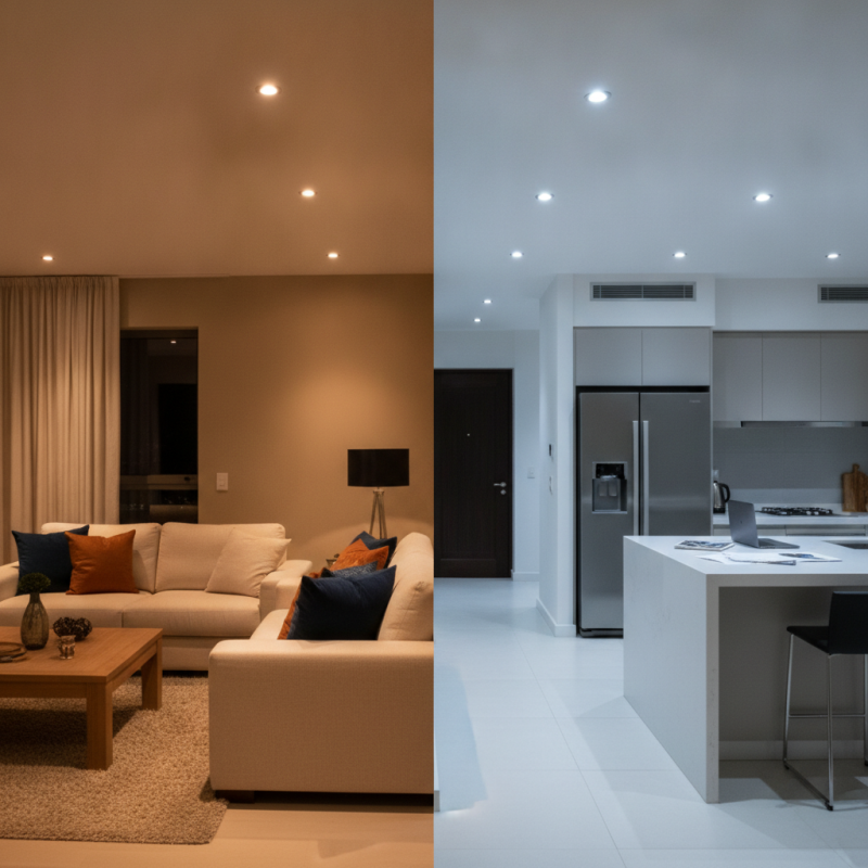
Color temperature plays a crucial role in creating the right atmosphere in any space. Measured in Kelvin (K), it ranges from warm (2700K) to cool (6000K). According to the Lighting Research Center, warmer tones are ideal for residential areas, fostering relaxation and comfort. In contrast, cooler temperatures enhance focus, making them suitable for workspaces.
One effective tip for choosing color temperature is to consider the room’s purpose. For a cozy living room, opt for around 2700K to 3000K. This range mimics traditional incandescent bulbs and invites warmth. In contrast, areas like kitchens or offices benefit from 3500K to 4100K, creating a brighter and more energetic environment.
Another insight comes from design studies showing that color temperature affects mood and productivity. An ideal lighting design balances different temperatures based on functions. For instance, a reading area might need 4000K light, while a movie night calls for lower temperatures. Testing various options in your space can provide a practical understanding of your preferences. Ultimately, ensuring color temperature aligns with the room's usage can elevate both aesthetic and functionality.
When selecting downlights, understanding color temperature is vital. Color temperature is measured in Kelvin (K) and impacts the ambiance of a space. Warm whites, around 2700K-3000K, create a cozy and inviting atmosphere. These tones are perfect for living rooms and bedrooms. They evoke feelings of relaxation and comfort.
Neutral whites range from 3500K to 4100K. This temperature provides a balanced light that suits various environments. It’s ideal for kitchens and workspaces. Neutral whites enhance detail and clarity without being harsh. On the other hand, cool whites (5000K-6500K) offer a crisp, bright light. This is beneficial in commercial settings or areas requiring concentration, like offices. However, it may disrupt the warmth desired in home areas.
Choosing the right color temperature takes reflection on the mood you want to create. Too cool a light can lead to a sterile feel. It’s worth noting that individual preferences play a significant role. Test samples in your space to see real-time effects. Adjustments can greatly enhance comfort and utility in your environment.
This bar chart represents the preferences of color temperatures for downlights, ranging from warm (3000K) to cool (7000K). The percentage indicated corresponds to the user preference distribution, helping you understand which color temperature might suit your lighting needs best.
Choosing the right color temperature for downlights can significantly affect your space's functionality and ambiance. Begin by identifying the purpose of the room. For example, kitchens and workspaces benefit from cooler, brighter lighting. A temperature between 4000K to 5000K enhances focus and productivity. In contrast, warmer temperatures, around 2700K to 3000K, are best for living areas and bedrooms. They create a cozy atmosphere, promoting relaxation.
Consider how color temperature interacts with your interior design. The same downlight can look different in various settings. Paint colors, furniture, and even window light can alter perception. This can lead to unexpected results. For instance, warm tones may feel overly yellow against beige walls. Experiment with samples before finalizing your lighting choices. It’s essential to match the light with the room’s activities to get it right. Always reflect on how lighting choices affect your daily life.
The color temperature of downlights influences how a room feels. Ranging from warm (2700K) to cool (5000K) tones, these temperatures create varied ambiances. Warm tones foster a cozy environment, ideal for living spaces. They invite relaxation and comfort. In contrast, cooler tones enhance focus and energy, making them suitable for workspaces.
Choosing the right color temperature can be tricky. A space flooded with cool white light may feel sterile. Conversely, too much warm light in a kitchen could hinder task efficiency. Consider the activities you will do in each room. Balance is key. Positioning warm and cool lights together can create depth and excitement.
Your own preferences matter significantly. Some people thrive in bright, well-lit spaces. Others prefer the intimate glow of softer light. Experimenting with different temperatures allows you to find what feels best. Take time to reflect on how each setting impacts your mood. It’s a personal journey of exploration and adjustment.
When selecting downlights, understanding color temperature is crucial. The three main types are warm, cool, and daylight. Warm light (2700K-3000K) creates a cozy atmosphere. Cool light (3500K-4100K) is bright and stimulating. Daylight (5000K-6500K) mimics natural sunlight.
Testing color temperatures in different environments helps you see what fits best. Use color samples or swatches to visualize the effect in your space. If possible, visit a store with lighting displays. Observe how various temperatures look under artificial and natural light.
Consider the activities in the room. Warm light works well for relaxation, while cool light is ideal for tasks. The choice should reflect the mood you want to create. Personal experiences are vital; what feels right to one may not work for another. Take your time and ensure you find the ideal balance.
| Tip Number | Tip Description | Color Temperature (in Kelvin) | Recommended Use |
|---|---|---|---|
| 1 | Consider the room’s purpose | 2700K | Living Room, Bedroom |
| 2 | Match your home’s design style | 3000K | Kitchen, Dining Area |
| 3 | Think about natural light | 3500K | Office, Study Room |
| 4 | Experiment with dimmers | 4000K | Bathrooms, Hallways |
| 5 | Use warm tones for relaxation | 2200K | Theater Rooms, Spa Areas |
| 6 | Consider energy efficiency | 5000K | Commercial Spaces |
| 7 | Test before you buy | 4000K | Artist Studios, Workshops |
| 8 | Pair colors with fixtures | 3000K | Dining Table Lighting |
| 9 | Stay consistent in color choice | 3500K | Living Areas |
| 10 | Know the difference between warm and cool | 5000K | Workshop, Garage |
: Color temperature measures light warmth in Kelvin (K). It influences the atmosphere of a space.
Warm light (2700K-3000K) creates a cozy and inviting atmosphere. It’s great for relaxation.
Neutral light (3500K-4100K) offers balanced illumination. It enhances detail without being harsh.
Cool light (5000K-6500K) provides bright, crisp illumination. It’s ideal for focused tasks and commercial areas.
The chosen temperature impacts mood. Warmer tones promote comfort; cooler tones enhance focus.
Yes, testing samples in your space is essential. Real-time effects help assess comfort and ambiance.
Excessive cool light can make a space feel sterile. Balance with warm light can improve comfort.
Absolutely! Individual preferences vary greatly. What feels right to one might not for another.
Combine warm and cool lights for depth. Reflect on activities in each room to achieve balance.
Experimenting allows you to explore different effects. It helps refine your ideal lighting situation.
Choosing the right color temperature for downlights is essential for creating the desired atmosphere and functionality in a space. Understanding color temperature, which ranges from warm to cool, helps in selecting the appropriate lighting that complements the purpose of each room. Warm tones create a cozy, inviting environment, making them ideal for living areas, while cooler tones are better suited for workspaces as they enhance focus and productivity.
In addition to identifying the purpose of the space, it’s important to consider how color temperature influences mood and ambiance. Potential buyers should also test and compare different color temperatures under actual lighting conditions before making a purchase. By following these guidelines, you can effectively answer the question of how to choose the right color temperature for downlights, ensuring a well-lit environment that meets your needs and preferences.
Pina Light