Choosing the right color temperature for downlights is more than selecting “warm” or “cool” from a product chart. It affects comfort, visibility, material appearance, and the emotional character of a room. The best choice depends on the space, surface colors, daylight levels, and how people use it.
Richard Kelly, a pioneering American lighting designer, said, “Light is not so much something that reveals, as it is something that creates.” His observation remains valuable when considering how to choose the right color temperature for downlights. A 2700K setting can create a soft, intimate atmosphere in bedrooms, lounges, and hospitality spaces. Around 3000K often provides a balanced appearance for homes, restaurants, and reception areas. Meanwhile, 4000K may support clearer visual tasks in kitchens, offices, workshops, and retail environments.
Still, numbers cannot replace experience. A 3000K downlight may look warm beside blue-gray walls, yet appear almost neutral beside timber flooring. I have seen display samples seem comfortable in a showroom, then feel harsh beneath a low ceiling. That mistake is easy to make. Test the fitting at night, beside the actual finishes, and at the intended mounting height. Check glare, shadows, dimming behavior, and color rendering. Do not judge color temperature alone.
There is no universal answer. Even a careful recommendation may need revision after installation. Good lighting design accepts that uncertainty and measures the real room, not just the specification sheet.
What Is Color Temperature in Downlights?
Color temperature describes the appearance of light from a downlight, measured in Kelvin (K).
It does not describe heat. Lower Kelvin values create warmer, more amber light, while higher values look cooler and bluer. A 2700K downlight can make timber floors and fabric sofas feel comfortable. A 4000K option usually appears cleaner and more neutral.
The room’s purpose should guide the choice. Warm light often suits bedrooms, lounges, and restaurants because it supports a relaxed atmosphere. Neutral white can help kitchens, bathrooms, and home offices look clear without feeling overly cold. Cool light may suit workshops or detailed task areas, but it can make small rooms feel harsh. Light direction, wall color, and ceiling height also change the result. I have seen a sample look balanced in a showroom, then appear too yellow at home.
Color temperature is only one part of good lighting.
Check the color rendering index, beam angle, dimming performance, and glare control. A high Kelvin rating does not guarantee better visibility. It may even reduce comfort during evening use. Test one downlight at the actual installation height, preferably beside the room’s existing surfaces. This step is easy to skip. That can be a costly mistake. Personal preference matters too, so technical guidance should support observation rather than replace it.
Choosing the Right Color Temperature for Each Room
Choosing the Right Color Temperature for Each Room
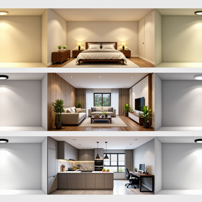
Color temperature changes how a room feels and functions. In living rooms, 2700K to 3000K downlights create a warm, relaxed atmosphere. This light suits timber, soft fabrics, and evening conversations. I have noticed that cooler light can make these rooms feel less comfortable after sunset.
Kitchens and bathrooms often benefit from 3500K to 4000K lighting. The cleaner tone can improve visibility when preparing food, shaving, or checking small details. However, overly cool light may make white surfaces look harsh. A high color rendering index, preferably 90 or above, can help reveal natural food colors and accurate skin tones. Test the light on your actual tiles and cabinets first. Samples can be surprisingly different.
Bedrooms usually work best with 2700K to 3000K downlights. Warmer light supports a calmer evening routine, especially near bedside areas. Home offices may need 3500K to 4000K for clearer daytime focus, but personal comfort still matters. A dimmer provides useful flexibility as daylight changes. Be careful, though. Not every downlight dims smoothly, and flicker can cause eye strain for some people. Room size, ceiling height, wall color, and daylight should guide the final choice. My own preference has changed after living with cool lighting; it looked efficient, but felt tiring at night.
Why Choose the Right Color Temperature for Downlights?
Choosing the Right Color Temperature for Each Room
These color temperatures are common residential starting points: warmer light around 2700K–3000K creates a relaxed atmosphere for bedrooms, living rooms, kitchens, and dining areas, while cooler light around 3500K–5000K can support visual clarity in bathrooms, home offices, utility rooms, and workshops. Actual preferences may vary with finishes, daylight, and personal comfort.
Comparing Warm, Neutral, and Cool White Downlights
Why Choose the Right Color Temperature for Downlights?
Warm white downlights, usually 2700K to 3000K, create a soft and relaxing atmosphere. They suit bedrooms, lounges, and dining areas with timber furniture. In evening tests, warm light often makes skin tones and beige surfaces feel more comfortable. However, it can make white walls appear slightly yellow. That effect is not always attractive.
Neutral white, commonly 3500K to 4000K, offers a practical middle ground. It keeps kitchens, bathrooms, and home offices looking clear without feeling harsh. I often recommend neutral light where people prepare food, read labels, or work with detailed materials. Its appearance still depends on wall paint, daylight, and ceiling height. A sample fitting is wiser than trusting a catalogue image.
Cool white, around 5000K to 6500K, produces a crisp, energetic appearance. It can help garages, workshops, and utility rooms feel more visible. Yet excessive cool light may create glare or make a bedroom feel clinical. Check the beam angle and glare rating, not only the Kelvin number. Color rendering also matters; a high CRI rating can reveal fabric and food colors more accurately. There is no universal winner. My own first choice has occasionally looked wrong after installation, especially beside warm lamps. Mixing temperatures in one open room can also feel unsettled, so test the lighting at morning and night before committing.
Why Choose the Right Color Temperature for Downlights? Comparing Warm, Neutral, and Cool White Downlights
Key Factors for Selecting the Ideal Color Temperature
Why Choose the Right Color Temperature for Downlights?
Key Factors for Selecting the Ideal Color Temperature
Color temperature changes how a room feels, even when brightness stays the same. Warm light, around 2700K to 3000K, creates a relaxed atmosphere in bedrooms, lounges, and dining areas. Neutral light, around 3500K to 4000K, often suits kitchens, bathrooms, and home offices. Cooler light can appear crisp, but it may feel harsh in a quiet living space.
Room purpose matters most. In a kitchen, neutral light can make food preparation and cleaning easier. In a bedroom, warm light supports a calmer evening routine. Consider wall colors and flooring, too. Cool white light may make grey surfaces feel colder. Warm light can deepen wood tones. Small details matter.
Check the color rendering index before choosing downlights. A high CRI helps fabrics, food, and skin tones appear more natural. Dimming compatibility is also important. Some lights shift color or flicker when dimmed. Test one fitting in the actual room first. This step prevents expensive changes later.
I have found that standard recommendations are useful, but they are not perfect. Daylight, ceiling height, and personal sensitivity can change the result. A 3000K fitting may feel warm in one room and surprisingly bright in another. Trust measurements, then trust your eyes.
Conclusion
Color temperature is a key feature of downlights, measured in Kelvin and expressed through warm, neutral, or cool white tones. It influences how a room looks, how clearly objects can be seen, and how comfortable people feel. Warm white creates a cozy, relaxing atmosphere for bedrooms, living rooms, and dining areas. Neutral white offers a balanced appearance that suits kitchens, bathrooms, offices, and general-purpose spaces, while cool white provides a crisp, energetic feel for work areas, garages, and task-focused environments.
How to choose the right color temperature for downlights depends on the room’s purpose, natural daylight, interior colors, and the mood you want to create. Consider whether the space is designed for relaxation, concentration, or detailed activities, and avoid using strongly contrasting color temperatures in connected areas. Selecting a consistent and suitable tone can improve visual comfort, enhance the room’s appearance, and make everyday activities more pleasant.
 Pina Light